
Making G-Pay Accessible For Visually Impaired People - In Collaboration with EnAble India NGO
User Research
Survey: With our collaboration with Enable India in this project, we rolled out the survey in their network and got around 20 responses. Apart from that, we did a few administrative surveys by visiting their office. From the survey, we got a few respondents for our interview. Also, from the survey, we figured out that the most used payment application is G-Pay among visually impaired people. To answer the question unheard in the survey, we invited 10 participants for an interview.

Interview: We conducted interviews with the 10 participants, some of whom were grouped interviews, some of them were virtual, some of them were telephonic, and the majority were in person. We gathered many insights from that then we decided to do move further and come up with the HMW statement, "How Might We Make G-Pay more Accessible For Visually Impaired People".

In this picture, my teammate Arushi is interviewing at Enable India Office
Pic Credit : Pranshu Anand
Contextual Inquiries: With 5 participants with whom we conducted in-person interviews, we made a contextual inquiry in which we asked them to do a few tasks on G-Pay. Than we also asked their pain-points to while using the applications and transfer the money.
Analysis Of User Research
Based on the user research conducted, we found that Google Pay was the most commonly used digital payment application by visually impaired users. Through follow-up interviews, participants were asked about the features they liked and disliked about the application, as well as what changes they would make to the app. From the interviews, it was discovered that there were certain areas of the application that needed improvement in terms of accessibility.One issue that was identified was that some features on the application were not properly labelled. This can make it difficult for visually impaired users to navigate the app and find the specific features they need. Proper labelling is important for accessibility, as it allows users to understand what each feature does and how to use it. Additionally, it was found that some features such as extra games and reward systems were not necessary for visually impaired users. These features may be appealing to some users, but they can also add unnecessary clutter to the app and make it more difficult to navigate. For visually impaired users, it is important to prioritize features that are essential and make the app more accessible. Another issue that was highlighted in the user research was the difficulty of scrolling down the app. TalkBack, a screen reader app used by visually impaired users to interact with their devices, expands all the sections on the screen, which can make it time-consuming to scroll through the app. This issue could be addressed by implementing more efficient ways of scrolling or by reducing the amount of information presented on each screen.
Converging Data Gathered From Survey , Interview & Contextual Inquiries Into
User Persona


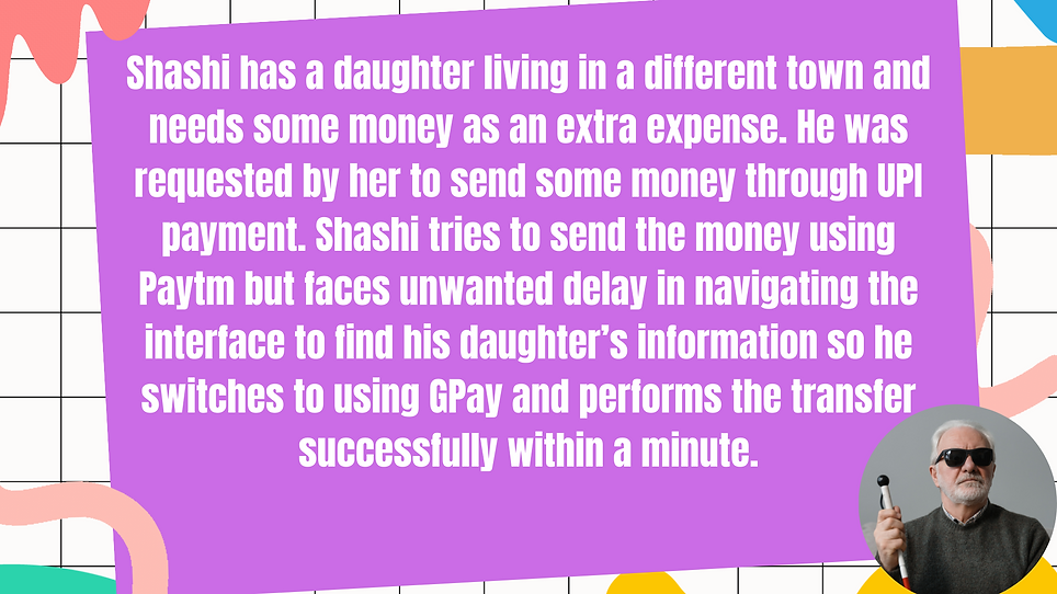
Scenario
.png)
.png)
.png)
Storyboard


Paper Prototyping - Proposed Changes

Explanation : Google Pay's home page has a feature where TalkBack, a screen reader for visually impaired users, automatically expands all the sections on the screen. However, we added a feature that requires the user to double-tap on the "more" drop-down menu before the section expands. On Screen 1, TalkBack is activated on a specific element. If the user swipes left, they will move to the next element on the screen, as shown in Screen 2. On Screen 3, the user is on the "more" drop-down menu, and they must double-tap to expand the section. Once expanded, the user will see the content of the section, as shown in Screen 4. If the user swipes left again, they will move further down the screen, as shown in Screen 5.

Explanation : We have added a new microphone feature to their search section to assist visually impaired users in searching for contacts easily. Instead of typing out the contact's name, users can now use voice commands to search for contacts. The feature is accessible through TalkBack and appears as a mic icon on the search bar. When users double-tap on the icon, a haptic microphone feature appears on the screen, allowing users to speak out the contact's name. Once the contact's name is recognized, it appears on the screen, and users can double-tap on it to proceed to the payment interface, which is shown on screen 4. The next step is to enter the amount on the payment interface, which is shown on screen 5

Explanation : During our testing of Google Pay, we found that when we navigated to the contacts payment page, the talk-back feature only read out the empty amount field. We felt that from a privacy and security perspective, it would be better for the talk-back feature to read out the name of the contact that the payment is being sent before reading out the amount section. Therefore, we modified the prototype to include this change. Additionally, we noticed that on the payment page where we had to enter the pin of the linked bank account, there were two unlabeled buttons labelled as "cross" and "tick". This caused issues with the talk-back feature, as it was unable to identify the buttons. To address this, we labelled the buttons in our prototype, improving the accessibility and ease of use for visually impaired users. Double-tapping the contact icon takes the user to the payment page screen, where they enter the payment amount. Once the amount is entered, they are directed to the payment gateway page screen where they confirm the payment. Double-tapping the pay button on this page takes the user to the final screen, where they enter their PIN. Screen 6 shows the labelled buttons on this final screen, ensuring that visually impaired users can easily navigate and complete the payment process.
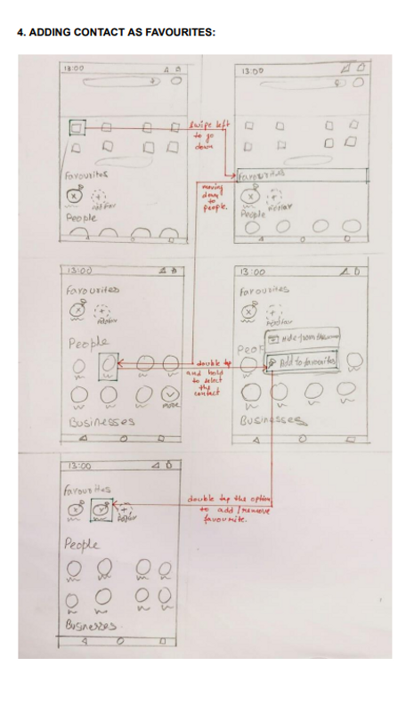
Explanation : We found that the TalkBack feature can make it tedious for visually impaired users to search for frequently paid contacts. To address this issue, we added a feature to the main screen of Google Pay, which allows users to add frequently paid contacts to a "Favorites" section. This feature saves time and space for users, allowing them to easily access and pay their frequent contacts. To add a contact to the Favorites section, users need to swipe left from the main screen and select the desired element. In Screen 3, when the user double-taps and holds the selected element (in this case, a contact), a menu appears on the screen, prompting the user to either add or remove the contact from the Favorites section (shown in Screen 4). Once the user selects "Add to Favorites," the contact is added to the Favorites section, as shown in Screen 5.
Wireframing - High Fidelity Prototype
We converted our paper prototype into high fidelity using Figma. Here is the video glimpse of our prototype and the link to figma file.
Credits
Arushi Preet Kaur, Naren, Sarvesh and Pranshu Anand